A LOOK AT REGIONAL VARIATION IN AFRICAN AMERICAN ENGLISH ACCENTS
Last April, at the height of the first wave of the COVID-19 pandemic, I defended my dissertation. It will come as no surprise to anyone that I’m only now getting around to writing about it — everyone I know who has a PhD needed some distance from their dissertation before they could really condense it and get out of the weeds enough to talk to regular people about it.
My 2020 dissertation was the first ever general description of regional variation in African American English accents. Plenty of other researchers have studied individual phonological variables (like whether or how often you pronounce an /r/ after a vowel, or if you pronounce words with a syllabic /r/ like Nelly saying “it’s getting hot in hurr”), other researchers have studied differences between places (like if you pronounce fewer /r/s if you’re from New York, or more hurrs for heres if you’re from St. Louis), and other researchers had studied entire vowel systems — roughly, how you pronounce all the vowels in English, so what does it really sound like when you say GOOSE and FOOT and is the vowel sound you make there different than someone else’s? — but mainly in one place. (shoutout, though, to Charlie Farrington, who wrote an excellent dissertation, available here, that looked at a single understudied variable — replacement of /t/ or /d/ with a glottal stop — and how it varied across four cities. He used the growing Corpus of Regional African American Language, or CORAAL, and his diss has the excellent title: Language Variation and the Great Migration: Regionality and African American Language). My dissertation was the first work to look at the entire vowel system for African American English speakers across the entire country.
To do this, I used a standardized reading passage. But it’s not as simple as it sounds, because I had to write a new one (with help and input from lots of linguists who are also native speakers of AAE, to reduce regionalisms from my own personal experience with AAE — y’all know who y’all is). Existing reading passages were, to quote a friend of mine who I had read one, "wack” (check it out for yourself). The reading passage I used is a short story about Marcus Junior, AKA Junebug, going to the barber shop by himself for the first time, just before his 12th birthday. It was intentionally designed with lots of characters and quotes to encourage using AAE instead of formal classroom English. (I’ve actually been asked about illustrating it and making it into a children’s book — if you’re connected to that world, get at me) I did some technological workarounds so people could go to my website and record themselves reading the passage, “Junebug Goes to the Barber”, and upload it from the comfort of their own homes. I solicited participation from friends, family, extended family, Facebook, Twitter — you name it. I got big pushes from connected people like Jon Jon Johnson, Lee Colston II, @afrothighty, and NPR’s Gene Demby. Ultimately, I got more than 200 recordings, about 180 of which I used for my analysis. That’s not a lot, but it’s also 12 full hours of audio and hundreds of thousands of vowels to measure. I asked people to change things they felt were unnatural, so that means I also had to retranscribe and align each of the recordings manually. The biggest difference was that there is a near universal preference in AAE for “everybody” and the reading passage had a few “everyone”s in it — this word preference is not something that has been written about by any linguists, to my knowledge. Shout out to Gene Demby for getting that conversation started. The whole survey and reading passage are available here.
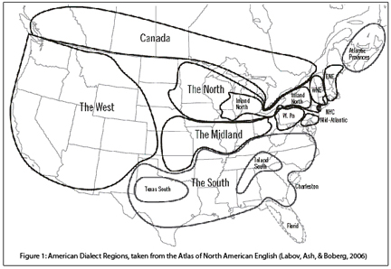
I wanted to compare to the gold standard, the Atlas of North American English, but our data collection techniques were very different. To compare against the ANAE, I decided to use modern geostatistical methods (kriging, getis-ord Gi* statistic, etc.), and I had to first show that these methods got results at least as good as the ANAE on the ANAE data. So I did that, corroborating the ANAE findings, but also making some new observations about the Northern Cities Vowel Shift along the way, challenging the dominant interpretation of how that shift started and spread. Then I used the same techniques to map pronunciation patterns in AAE. Lastly, instead of drawing dialect region boundaries by hand and superimposing my hand drawn maps to make dialect regions (a classic technique!), I used techniques from computational historical linguistics and from biology to allow the data themselves to tell me where the boundaries and clusters are. I used k-means clustering and hierarchical clustering analyses to determine how many regional varieties of AAE they are, and what their boundaries are.
My participants were overwhelmingly young, female, and well-educated, meaning that for all of my findings about how AAE differs from white Englishes, these findings are conservative, and understate the differences. As any sociolinguist will tell you, in general, the higher the level of education we attain, the more work we do to erase our unique, local accents — insofar as the features of the accent are something we are consciously aware of.
A note on maps: Some of the maps below use a technique that’s used in mining and in weather maps, to interpolate values for visualization. Do not over interpret where there are no people. I don’t have any participants from Wyoming, so the values there are just a computer’s statistical best guess based on what’s near by and what’s farther away. More research is definitely needed, and bigger projects with more people in each city (like the Corpus of Regional African American Language, or CORAAL), will shed more light on these nuanced differences. For all of the maps, the lighter color is usually more intensity of the shift under discussion, and the darker color is usually less intensity (or absence).
A note on audio: Some audio examples here are from my dissertation, others are celebrities, and some are recordings from the street. If they are only labeled with a place, they are from my dissertation research, and I am protecting the participants’ identities.
So what did I find?
This is barely scratching the surface, since this is just the first in a series of blog posts, but my main findings were:
There is no one Black Accent.
Black folks (and linguists) been knew this. AAE exhibits strong regional variation, so people from NYC sound different from Philly and they both sound different from Atlanta and Chicago. California is different from all of them (but has similarities to DC and Baltimore, by coincidence), and Kansas City is doing its own thing. This sometimes surprises people to hear, but think about celebrities’ voices: Jay-Z (NYC) doesn’t sound like Kevin Hart (Philadelphia), and you’d never confuse either for Ryan Coogler (Richmond, CA).
This dramatic variation existed even among highly educated people who have a strong command of “classroom” “standard” English. Even during a reading task, which are known to cause people to speak more formally and more carefully than in casual conversation.
This means that…
Things claimed to be universal in AAE are not.
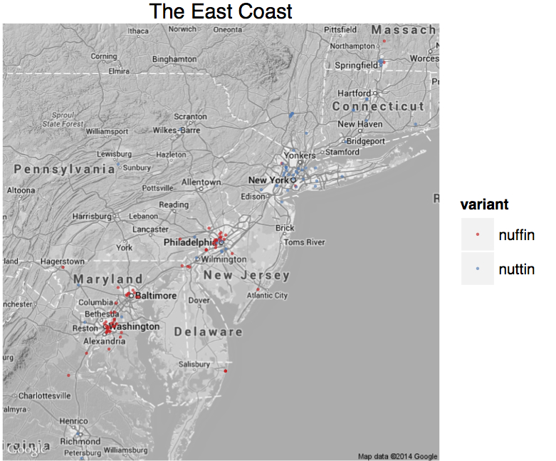
The PIN-PEN merger has historically been claimed to be a universal feature of AAE. That’s great, except it is absolutely not universal in the Northeast. Yes, I hear it in Harlem. I also hear vernacular AAE speakers who distinguish between PIN and PEN, in both NYC and Philadelphia. (Sharese King has already written about this in California, see below for some NYC examples).
AAE is supposed to not exhibit the COT-CAUGHT merger, and by and large it doesn’t, even in places where everyone else has it. So for instance, Black folks from California tend to pronounce “on” like white New Yorkers (or sometimes, white Southeasterners) and not like white Californians. Don’t believe me? Listen to how Tiffany Haddish pronounces “on” “dog” and “ball”, or how Snoop Dogg says “on.” Yes, they’re different from one another, but they’re also very different from the pronunciations in other California accents.
But here’s the thing. AAE speakers in parts of Florida, Georgia, and South Carolina often do have the COT-CAUGHT merger, opposite local white people. As an aside, I remember years ago explaining the COT-CAUGHT merger to a friend from Atlanta in a cafe in Harlem, so I expected this finding, but it seemed to really surprise quite a few linguists (when you read this, hi Bri-bri!).
That brings me to the next finding:
AAE has a lot of the same kinds of changes as white dialects, but they follow a completely different geographic distribution, and may have developed completely independently. So white people have the COT-CAUGHT merger in California but not in Georgia, and Black people have it in Georgia but not in California. White people say words like DOWN so it sounds like day-own in parts of the Deep South, black people do it in New York (compare Jay-Z saying “bounce (with me),” “down,” or “uptown” to Robert De Niro saying those same words). White folks are slowly moving where they pronounce words like GOOSE and GOAT further forward in the mouth in the Southeast, moving westward toward Texas, and Black folks do it in the Midatlantic (most especially DC and Baltimore) and in California.
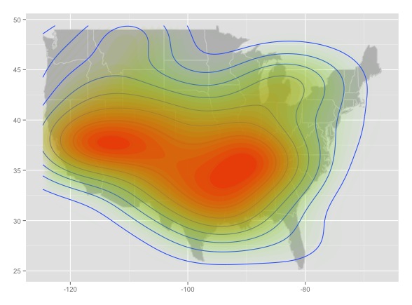
These shared patterns include chain shifts (not just one-off changes) described in the Principles of Linguistic Change, but, again, for totally different regions. For instance, the Back Upgliding Shift, also known as the “second Southern vowel shift” is present in AAE, but it’s not limited to the South, and isn’t present for Black folks in my sample from all the places it is present among white English speakers.

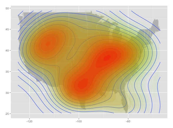
The “back upgliding” shift, or “second south” shift, from the Atlas of North American English

The Back Upgliding Shift in my data.
For reference, here’s the same shift in the Atlas of North American (white) English:

That’s because:
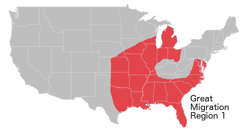
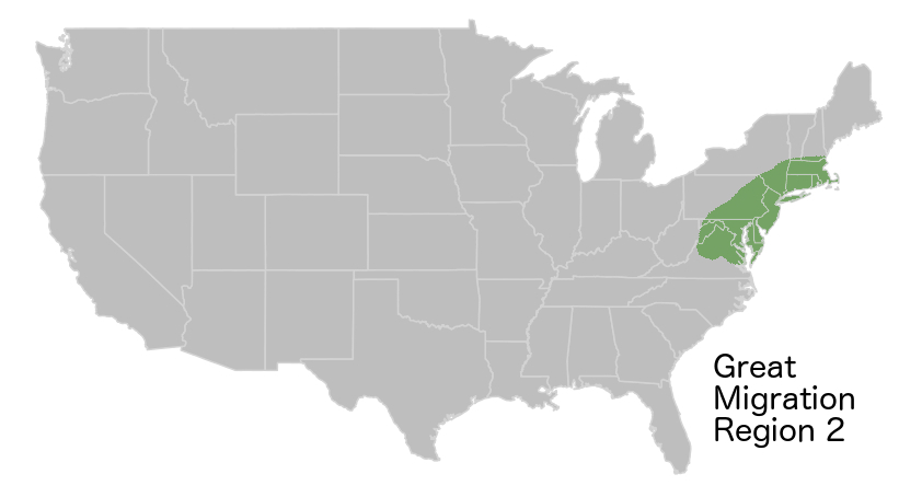
Black accents pattern with the Great Migration. As black people fled racial terrorism in the South, and migrated across the country, their patterns of movement were very different than the patterns of movement of white people across the country. To over simplify, black people moved south-to-north, white people moved east-to-west. Segregation and Jim Crow only amplified this, so Black people in Chicago tend to sound more like Black people in Mississippi than white people in Chicago. In fact, one linguist made a convincing argument that, at a minimum, you can’t rule out “fear of a black phonology” as a main driver of the Northern Cities Vowel Shift (Van Herk, 2008). If there were already black people in decent numbers, as in New York, there was a founder effect — newcomers learned to speak like the people who were already there. If there wasn’t already a large Black population, like in Chicago, this didn’t really happen. These things play out in complex ways that are dependent on which parts of an accent are really noticeable to people and which aren’t.
Even more than that, there were already differences in Black accents across the South. Regional variation in Black accents today are the product of modes of travel in the 19th and 20th centuries (rivers and railways). But the starting point was shaped by the location of shipping routes and slave ports where abducted and enslaved Africans were first taken.
what are the patterns?
I was curious what story the data would tell without me interpreting them, so I used a few different clustering algorithms on people’s vowel spaces. I gave the computer all the vowel measurements for each of the vowel classes for each person, but did not give the computer any geographical data, and I asked for it to group similar with similar. Using Agglomerative Nesting, or AGNES, to look at hierarchical structure without geographic data, the results showed strong geographic patterns. People from The Bronx sounded like other people from The Bronx, and when you measure all of their pronunciations, they’re closer to each other than to people from anywhere else. But people from Brooklyn form the next closest grouping. And people from Philly are closer in their pronunciations to people from Brooklyn and The Bronx than people from Atlanta are. And so on.

An example sub tree from my dissertation research. (I know this is tiny; I will share more readable versions of the trees in future posts).
The question is then, how do you group these clusters? There are a handful of different statistical techniques to determine this from the data, and they all seemed to suggest around 10 groupings. Using knowledge about the real world, it looks like it should probably be about 12: the computer wants to group California with the DMV (D.C., Maryland, and Virginia), probably because they both pronounce the GOOSE and GOAT vowels with the body of the tongue further forward in the mouth (audio examples below); and it wants to group North Carolina and Michigan, which may be one group based on patterns of migration, or may not.
In the future, I plan to build on this research, and to make more artistic maps — these were for my dissertation, which is a target audience of about 3 people.
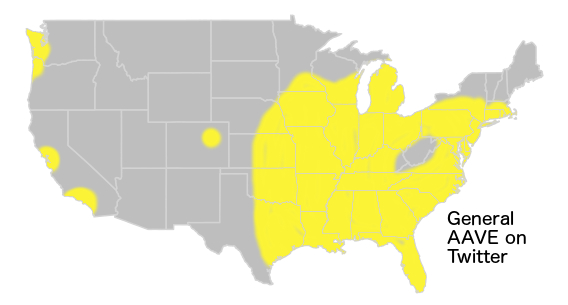
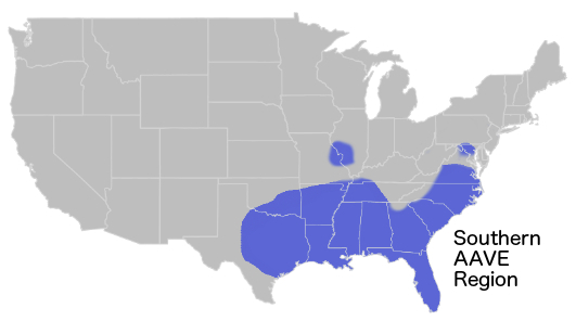
Mapping with 5 clusters really captures the Great Migration, but loses some of the granularity of the East Coast, and important differences up the Mississippi. It also looks almost exactly like the maps I produced of lexical variation in Twitter data in 2015.

Mapping 10 clusters gives a better perspective on regional differences, especially in the Northeast, and shows more granularity up the Mississippi. Chicago and Jackson, Mississippi are more similar to one another than to New York, but this higher level of granularity captures that Chicago and Minneapolis are more alike than Chicago and Jackson, 50 years after the Great Migration.

Agglomerative hierarchical clustering with vowel data (and no geographic data), with 10 clusters.
Remember that in each of these we need to add a little world knowledge: California and DC are probably not a real cluster, they just share common features, likely by chance. Specifically, fronting of the vowels in GOOSE and GOAT. (I have given semi-exaggerated audio examples here).

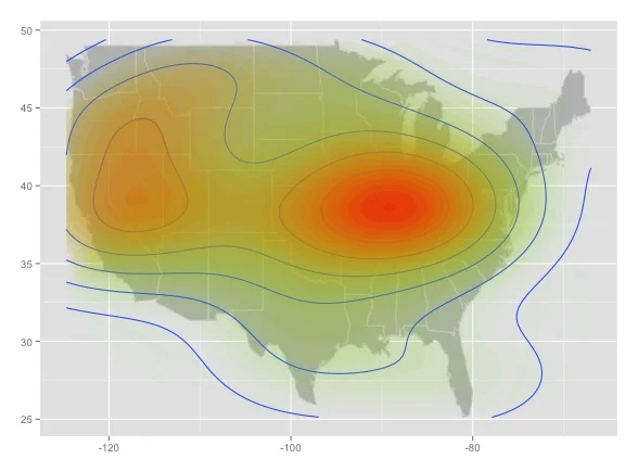
Hotspots for fronting and raising of /uw/ as in GOOSE and /ow/ as in GOAT on the East Coast.

GOOSE fronting in California.

GOOSE fronting.
For comparison, here’s fronting of /uw/ in the Atlas of North American (white) English, where fronted /uw/ is circled in Orange.

How do you tell where someone is from by their accent?
In the last few years, I’ve been able to pinpoint where new people I meet are from. It’s almost a party trick at this point — I’m no Henry Higgins, but I’ve astonished and impressed quite a few people by pinpointing what state, or part of a state, they’re from. Obviously, I can’t teach everything there is to know, but there are some geographic patterns that are very salient. In future posts, I will do some deep dives into individual local accents.
Here are some of the patterns. These are generalizations and do not mean that all people from that location have that pronunciation. Rather, it reflects where a particular sound is more common.
The “African American Vowel Shift” (AAVS) involves swapped vowel nuclei for /iy/ as in FEET and /i/ as in KIT, swapped nuclei for /ey/ as in FACE and /e/ as in DRESS, and raised /uh/ as in STRUT. AAE speakers with the AAVS are from (eastern) North Carolina, and a broad path upward from the Gulf states to the Great Lakes. Note that it’s gradient, so for instance, Snoop Dogg, from California, has the shifted nuclei of /iy/ and /i/, but in general it was less prominent in my participants from California than it was in the Gulf.
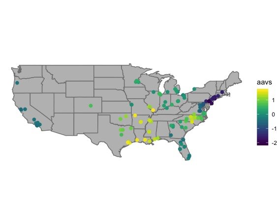
The “African American Vowel Shift” (AAVS)
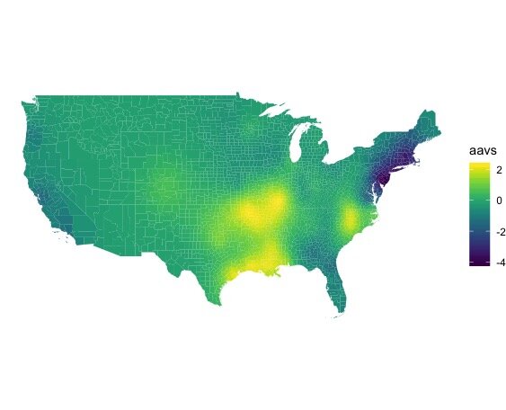
The “African American Vowel Shift” (AAVS)
Fronted GOOSE and GOAT vowels? That’s Washington D.C., Baltimore, and to a lesser extent, California (see above).
MARY-MARRY-MERRY merger, with centralized /r/ for MARRY (so MARY-MERRY are pronounced like “may-ree” and MARRY is pronounced like “Murray”)? Baltimore and DC only. Same goes for “fear” rhyming with “fur,” but this isn’t universal by any means, it’s just the main place this shift is attested at all.
Back GOOSE and GOAT, no PIN-PEN merger, and none or few of the reversals of the AAVS? That’s the Northeast, especially New York City and Philadelphia. (That’s the dark color on the AAVS map). The fact that many, many AAE speaking New Yorkers do not have the PIN-PEN merger should not come as a surprise to anyone who has heard any hip hop from New York since, well, ever (like how Whodini says “friends” in 1982, or how Biggie Smalls says everything).

Strongest PIN-PEN merger in the AAE data.

PIN-PEN merger on the east coast. Strongest in Virginia Beach, weakest in NYC.

Distributions of some PIN and PEN words among New Yorkers. Notice how you can divide them up pretty well.
As an aside, it has always perplexed me how linguists can teach that the PIN-PEN merger is a core, universal feature of AAE, and then go home and listen to hip hop from NYC where entire rhyme schemes are built on not having that merger. That Whodini track is 40 years old, and both cuts I included here for educational purposes were hit songs. The counter-evidence to our textbooks is literally all around us, every day.
COT-CAUGHT Merger? Your best bet is Florida, but you could go as far afield as Georgia and parts of South Carolina. Compare the vowel spaces for Florida and New York, below (AA refers to the COT vowel and AO refers to the CAUGHT vowel).

COT and CAUGHT vowels for Florida.

COT and CAUGHT vowels for New York.
Just look at that beautiful separation in the second on the top (from Brooklyn) or the entire second row!
Raised and fronted /uh/ as in STRUT? Best bet is Kansas City or St. Louis, and parts of Oklahoma. This is why a colleague of mine from Oklahoma says he’s country with the same vowel I have in the word book.

Vowel in DOWN/TOWN/MOUTH sounds like /æ/ (as in “cat”) or even /e/ (as in “bed”) or /ey/ (as in “say”) at the onset? Atlanta or NYC are most likely. For instance, listen to how the conductor on the 1 train in New York says “town” and “bound” in the clip below (“one-two-five where it always stays live. This is Harlem, one hundred and twenty fifth street. This is a one-three-seven bound uptown one. The next and last stop is 137, stand clear”), or how Jay-Z says “down” in the clip below that, from an interview on the Breakfast Club.
Vowel in CAUGHT/HAWK/DAWN starts with an oo sound? New York and Philadelphia. (and most places if it’s before an n).
Vowel in CAUGHT/HAWK/DAWN starts with /æ/ as in “cat”? Strongest in Mississippi and Alabama, but you’ll also find it in Tennessee, Kansas, Missouri, etc.
There are tons more patterns that I haven’t even touched on (what vowel do you have for “there”? How often do you pronounce /v/ after a vowel as in love or believe? What vowel do you have in words like thing? How often do you pronounce /r/ or /l/ after vowels? If you don’t pronounce it, do you replace it with a /w/ sound?). And these all work together as a coherent system.

Some AAE vowel systems.
Note the difference between bought and bot patterns in the Northeast and Southeast, or the patterns around where bait and bet are in North Carolina and the Gulf states, or where bat is relative to other words in these charts…these are very distinct sound systems.
So what now?
My biggest hope for the future is that researchers stop treating AAE like local divergences from white dialects, and really lean into treating it as its own set of systems instead of writing papers about a single vowel or consonant in a single place or two — this is why I tend to prefer Sonja Lanehart (and others’) approach to AAL, where the L is for Language. Theres so much more to say about this, and about regional variation, but I’ll stop here for now. My full dissertation is available here, but may only be interesting to readers interested in highly technical and detailed explanations of the statistics. I am, however, in the process of turning this material into a more digestible form for people outside of academic linguistics. Over the next few months, I will be writing posts that detail the accents of specific places, and what their unique features are, including some that I observed, but that did not make it into my dissertation (like regional patterns in how people pronounce thing). I hope that my work helps contribute to the growing chorus of voices in and outside of academia who are challenging the myth that there is one black accent, and who are challenging the academic approach that treats African American Language as just a few extra bells and whistles on local white varieties and not as its own rich linguistic variety not defined by its relationship to other language varieties.
-----
©Taylor Jones 2021
Have a question or comment? Share your thoughts below!