
The Problem With Twitter Maps
Twitter is trending
I'm a huge fan of dialect geography, and a huge fan of Twitter (@languagejones), especially as a means of gathering data about how people are using language. In fact, social media data has informed a significant part of my research, from the fact that "obvs" is legit, to syntactic variation in use of the n-words. In less than a month, I will be presenting a paper at the annual meeting of the American Dialect Society discussing what "Black Twitter" can tell us about regional variation in African American English (AAVE). So yeah, I like me some Twitter. (Of course, I do do other things: I'm currently looking at phonetic and phonological variation in Mandarin and Farsi spoken corpora).

Image of North America, entirely in Tweets, courtesy of Twitter Visual Insights: https://blog.twitter.com/2013/the-geography-of-tweets
Moreover, I'm not alone in my love of Twitter. Recently, computer scientists claim to have found regional "super-dialects" on Twitter, and other researchers have made a splash with their maps of vocatives in the US:

More and more, people are using social media to investigate linguistics. However, there are a number of serious dangers inherent to spatial statistics, which are exacerbated by the use of social media data.
Spatial statistics is developing rapidly as a field, and there are a number of excellent resources on the subject I've been referring to as I dig deeper and deeper into the relationship between language and geography. Any of these books (I'm partial to Geographic Information Analysis) will tell you that people can, and do, fall prey to the ecological fallacy (assuming that some statistical relationship that obtains at one level, say, county level, holds at another level -- say, the individual). Or they ignore the Modifiable Areal Unit Problem -- which arises out of the fact that changing where you draw your boundaries can strongly affect how the data are distributed within those boundaries, even when the change is just in the size of the unit of measurement.
The statistical consideration that most fascinates me, and seems to be the most likely to be overlooked in dealing with exciting social media data, however, is the problem of sampling.
Spatial Statistics aren't the same as Regular Statistics.
In regular statistics, more often than not, you study a sample. You can almost never study an entire population of interest, but it's not generally a problem. Because of the Law of Large Numbers, the bigger the sample, the more likely you are to be able to confidently infer something about the population the sample came from (I'm using the day-to-day meanings of words like "confidence" and "infer"). However, in the crazy, upside down world of spatial statistics, sampling can bias your results.
In order to draw valid conclusions about some kinds of spatial processes, it is necessary to have access to the entire population in question. This is a huge problem: If you want to use Twitter, there are a number of ways of gathering data that do not meet this requirement, and therefore lead to invalid conclusions (to certain questions). For instance, most people use the Twitter API to query Twitter and save tweets. There are a few ways you can do this. In my work on AAVE, I used code in Python to interact with the Twitter API, and asked for tweets containing specific words -- the API returned tweets, in order, from the last week. I therefore downloaded and saved them consecutively. This means, barring questionable behavior from the Twitter API (which is not out of the question -- they are notoriously opaque about just how representative what you get actually is), I can claim to have a corpus that can be interpreted as a population, not a sample. In my case, it's very specific -- for instance: All geo-tagged tweets that use the word "sholl" during the last week of April, 2014. We should be extremely careful about what and how much we generalize from this.
Many other researchers use either the Twitter firehose or gardenhose. The former is a real-time stream of all tweets. Because such a thing is massive, and unmanageagable, and requires special access and a super-computer, others use the gardenhose. However, the gardenhose is a(n ostensibly random) sample of 10% of the firehose. Depending on what precisely you want to study, this can be fine, or it can be a big problem.
Why is sampling such a problem?
Put simply, random noise starts to look like important clusters when you sample spatial data. To illustrate, this, I have created some random data in R.
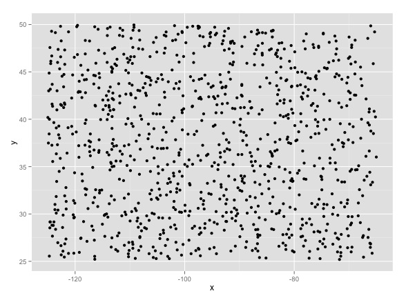
I first created 1,000 random x and 1,000 random y values, which I combined to make points with random longitudes (x values) and latitudes (y values). For fun, I made them all with values that would fit inside a box around the US (that is, x values from -65 to -118, and y values from 25 to... Canada!). I then made a matrix combining the two values, so I had 1,000 points randomly assigned within a box slightly larger than the US. That noise looked like this:
" Sir, the possibility of successfully navigating an asteroid field is approximately 3,720 to 1. " "Never tell me the odds!"
Before we even continue, it's important to note two things. First, the above is random noise. We know this because I totally made it up. Second, before even doing anything else, it's possible to find patterns in it:

A density contour plot of random noise. Sure looks like something interesting might be happening in the upper left.
Even with completely random noise, some patterns threaten to emerge. What we can do if we want to determine if a pattern like the above is actually random is to compare it to something we know is random. To get technical, it turns out random spatial processes behave a lot like Poisson distributions, so when we take Twitter data, we can determine how far it deviates from random noise by comparing it to a Poisson distribution using a Chi-squared test. For more details on this, I highly recommend the book I mentioned above. I've yet to see anyone do this explicitly (but it may be buried in mathematical appendices or footnotes I overlooked).
This is what happens when we sample 100 points, randomly. That's 10%; the same as the Twitter gardenhose:

a 100 point sample.
And this is what happens when we take a different 100 point random sample:

Another random 100 point sample from the same population.
The patterns are different. These two tell different stories about the same underlying data. Moreover, the patterns that emerge look significantly more pronounced.
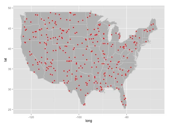
To give an clearer, example, here is a random pattern of points actually overlaying the United States I made, after much wailing, gnashing of teeth, and googling of error codes in R. I didn't bother to choose a coordinate projection (relevant XKCD):
And here are four intensity heat maps made from four different random samples drawn from the population of random point data pictured above:
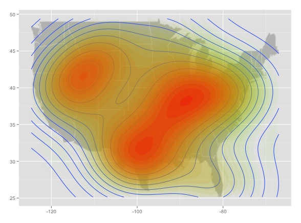
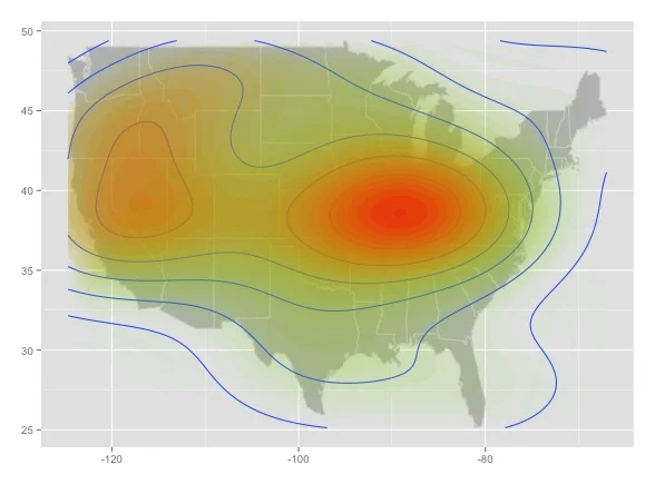

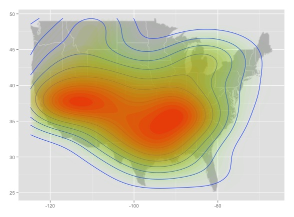
This is bad news. Each of the maps looks like it could tell a convincing story. But contrary to map 3, Fargo, North Dakota is not the random point capital of the world, it's just an artifact of sampling noise. Worse, this is all the result of a completely random sample, before we add any other factors that could potentially bias the data (applied to Twitter: first-order effects like uneven population distribution, uneven adoption of Twitter, biases in the way the Twitter API returns data, etc.; second-order effects like the possibility that people are persuaded to join Twitter by their friends, in person, etc.).
What to do?
The first thing we, as researchers, should all do is think long and hard about what questions we want to answer, and whether we can collect data that can answer those questions. For instance, questions about frequency of use on Twitter, without mention of geography, are totally answerable, and often yield interesting results. Questions about geographic extent, without discussing intensity, are also answerable -- although not necessarily exactly. Then, we need to be honest about how we collect and clean our data. We should also be honest about the limitations of our data. For instance, I would love to compare the use of nuffin and nuttin (for "nothing") by intensity, assigning a value to each county on the East Coast, and create a map like the "dude" map above -- however, since the two are technically separate data sets based on how I collected the data, such a map would be completely statistically invalid, no matter how cool it looked. Moreover, if I used the gardenhose to collect data, and just mapped all tokens of each word, it would not be statistically valid, because of the sampling problem. The only way that a map like the "dude" map that is going around is valid is if it is based on data from the firehose (which it looks like they did use, given that their data set is billions of tweets). Even then, we have to think long and hard about what the data generalizes to: Twitter users are the only people we can actually say anything about with any real degree of certainty from Twitter data alone. This is why my research on AAVE focuses primarily on the geographic extent of use, and why I avoid saying anything definitive about comparisons between terms or popularity of one over another.
Ultimately, as social media research becomes more and more common, we as researchers must be very careful about what we try to answer with our data, and what claims we can and cannot make. Moreover, the general public should be very wary of making any sweeping generalizations or drawing any solid conclusions from such maps. Depending on the research methodology, we may be looking at nothing more than pretty patterns in random noise.
-----
©Taylor Jones 2014
Have a question or comment? Share your thoughts below!